Color 101: Color Basics for Print and Marketing
Updated December 2025: This post was originally published October 11, 2022, and was updated to include information on RGB vs CMYK for Designers along with revised links and other details.
Understanding the Use of Color Theory in Marketing and Print
Color is one of the most impactful visual communication tools and is so powerful that colors can convey specific meanings or spark particular emotions. When pairing colors together for your print marketing material, you may notice that some work better together than others. Sometimes it can be confusing to figure out what colors go together and why. It is also important to consider how your colors will show up on white paper versus on colored paper. To clarify how color theory works in marketing and print, we have put together some tips and key points to consider when deciding what colors to use, how, when, and why.
Starting with the Basics
Like you learned in your early education, there are three primary colors: red, blue, and yellow. Primary colors are colors that can not be created through the mixing of other colors. Secondary colors are made from mixing two of the primary colors together. Those colors are green, purple, and orange. But there are also tertiary colors which are made by mixing adjacent primary and secondary colors together. Those colors are teal, chartreuse, amber, vermillion, magenta, and violet. For a visual color reference, see the color wheel below.
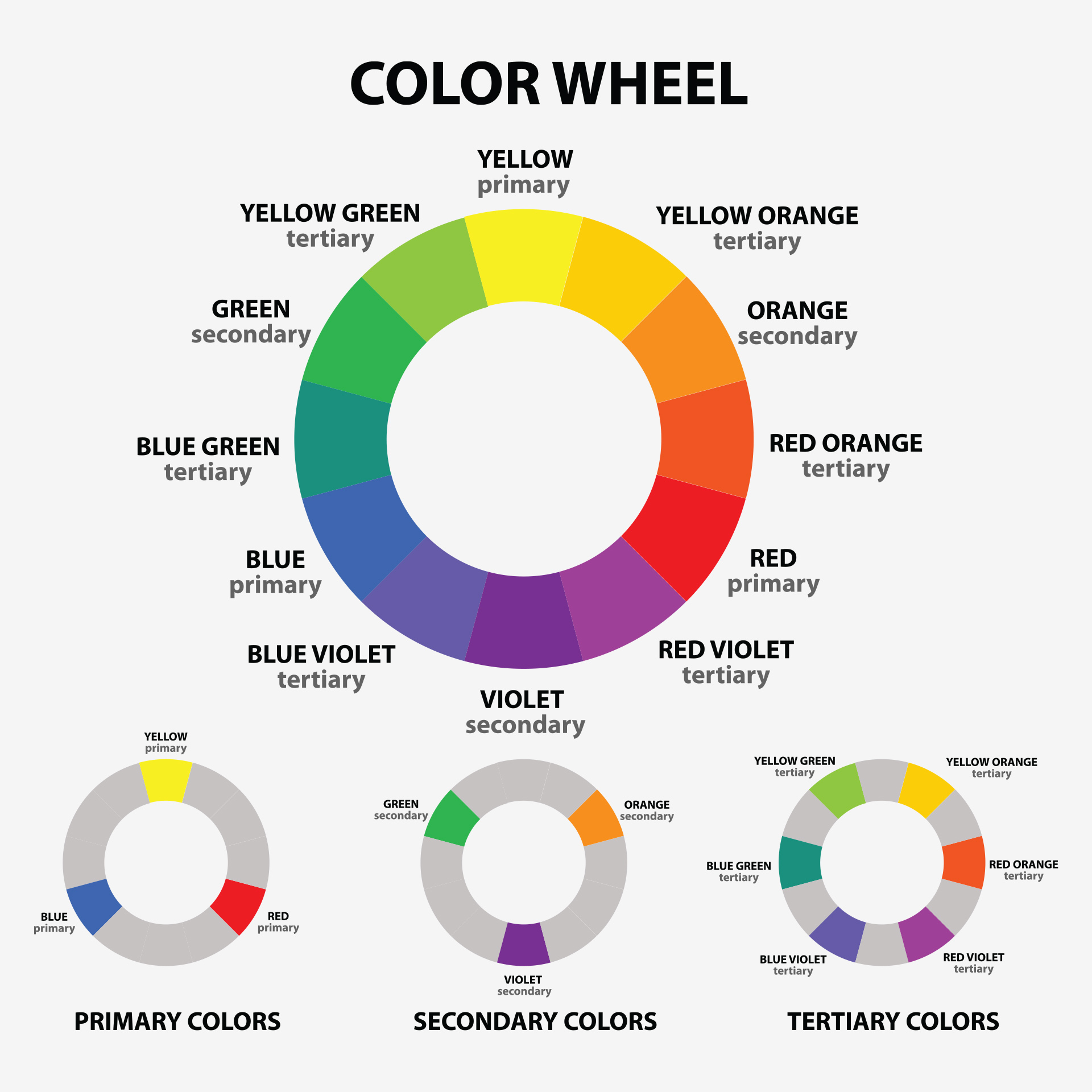
Complementary Colors
An easy way to distinguish which colors are complementary is to look at a color wheel. Complementary colors are parallel from each other on that wheel: red to green, blue to orange, and yellow to purple. These colors are considered complementary because they bring out the vibrancy of the other when put next to each other. Pairing such colors together can create an impactful and eye-catching color concept.
Analogous Colors
Analogous colors are colors that are neighboring each other on the color wheel such as blues, greens, and purples and yellows, oranges, and reds. When pairing analogous colors together, you create a more calming, harmonious, low-contrasting color palette, as opposed to a high contrasting color palette when using complementary colors. When using an analogous color palette, one color is typically used as the dominant color. The secondary color(s) is used as a supporting color to the dominant one. Then the third color(s) acts as an accent color. By having a dominant, secondary, and an accent color, it becomes more visually balanced when all paired together.
Monochromatic
Rather than creating contrast with different colors, you create contrast by pairing darker and lighter hues next to each other. Having a monochromatic color scheme is when you use one hue of color that varies by its tints and shades. Different tints are achieved by the amount of white added to the base color and shades are derived from adding darker colors such as grays and black. By having multiple variations of a color, it will be more visual when creating your vision.
Using Colors in Marketing and Print
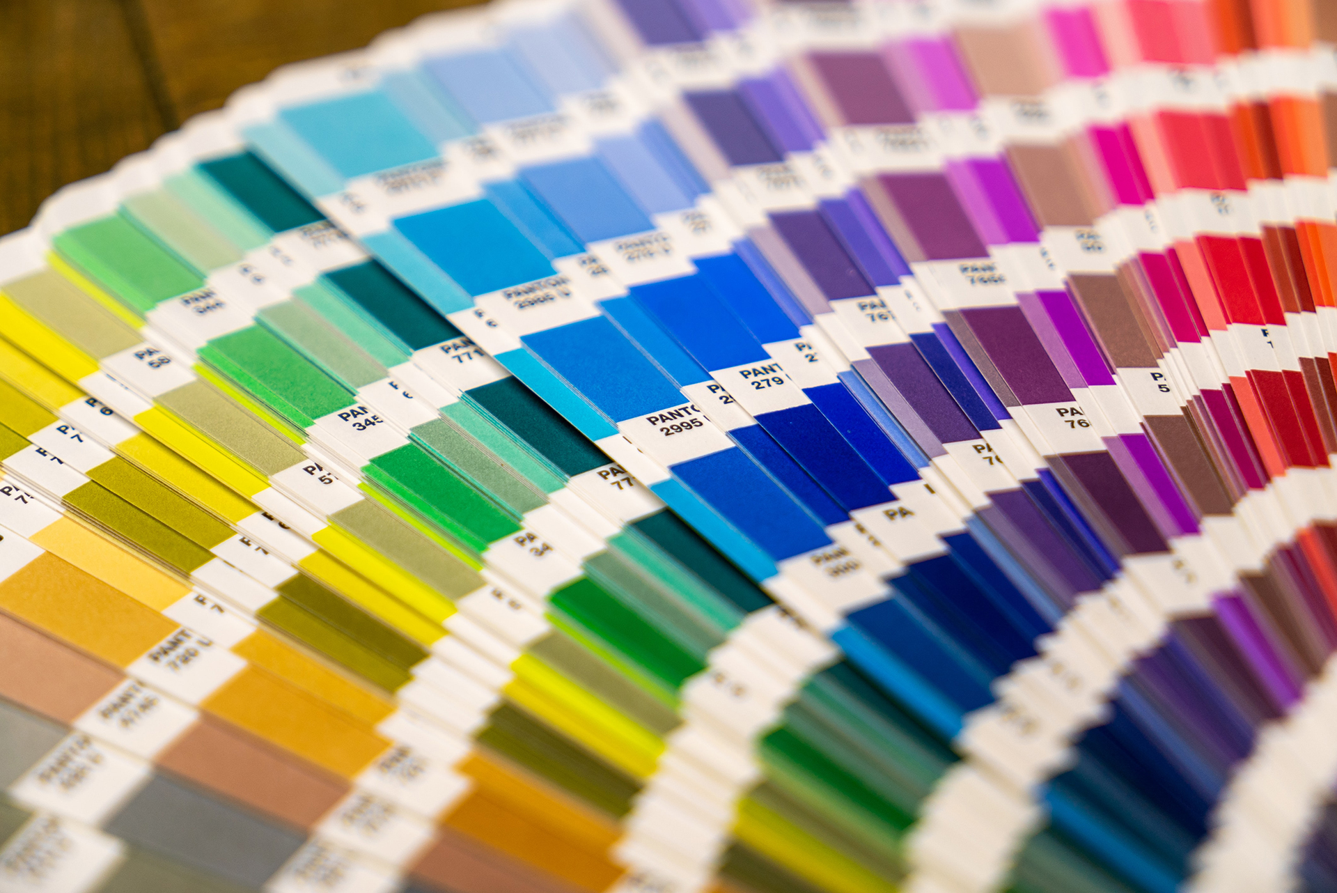
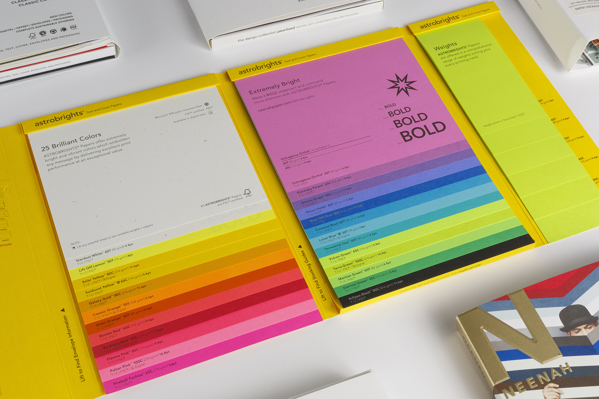
Here at WCP Solutions, we offer a full hands-on paper experience when planning your next printing project. Our Sample Library have numerous paper options with different weights, textures, colors, and finishes that can easily be compared side by side. Not to mention, we have examples of other touches that you may use on marketing collateral, such as foiling, embossing, and metallic inks. We can even do paper mock ups to help you visually see the final result of your project before printing.
The Print Difference Between CMYK and RGB
You have probably heard of the terms CMYK and RGB, which stand for cyan, magenta, yellow, and key (black), and red, green, and blue. But what are they, and how do they differ? What are their similarities? Both CMYK and RGB are color models used throughout the design and print world to create and display color. The main difference is how they work. RGB is an additive model that uses light, which makes colors look bright, saturated, and vibrant on screens. CMYK is a subtractive model that builds color with layers of ink, creating tones that appear more muted, natural, and grounded. In short, RGB lights up digital designs, while CMYK brings printed pieces to life on paper.
Why is understanding the different color models important? For printers, CMYK is the standard color model. Presses rely on layering cyan, magenta, yellow, and black inks to produce accurate colors. This approach is ideal when printing files that require specific brand colors and colored images. When a file is converted to RGB before printing, the press must convert the colors to CMYK, which can often lead to slightly off or inconsistent colors because the same hex code for CMYK is not always translated the same way from RGB.
For graphic designers and other digital creatives, it’s important to switch your software to CMYK early in the design process because RGB displays can show colors outside the printable range. This means that fluorescent blue, neon yellow, and rich red may not be accurately reproduced when converted for print. Designing in CMYK helps ensure that what you see on your screen matches what the press can actually produce.
Contact our Team for More Information
In a world full of color, it is time we start thinking outside the white box. We promise it is not a tear-able idea. So let us help inspire your next printing project. For more information on paper or custom packaging, contact your local WCP account manager or customer service team. We’d be happy to set up a consultation to discuss the best paper options to meet the goals of your next upcoming project and business. Give us a call today at (877) 398-3030.